Design · October 22, 2026
Type Is the Interface
Ninety percent of your website is text. Design it like it matters.
Elsie · Founder & Creative Director
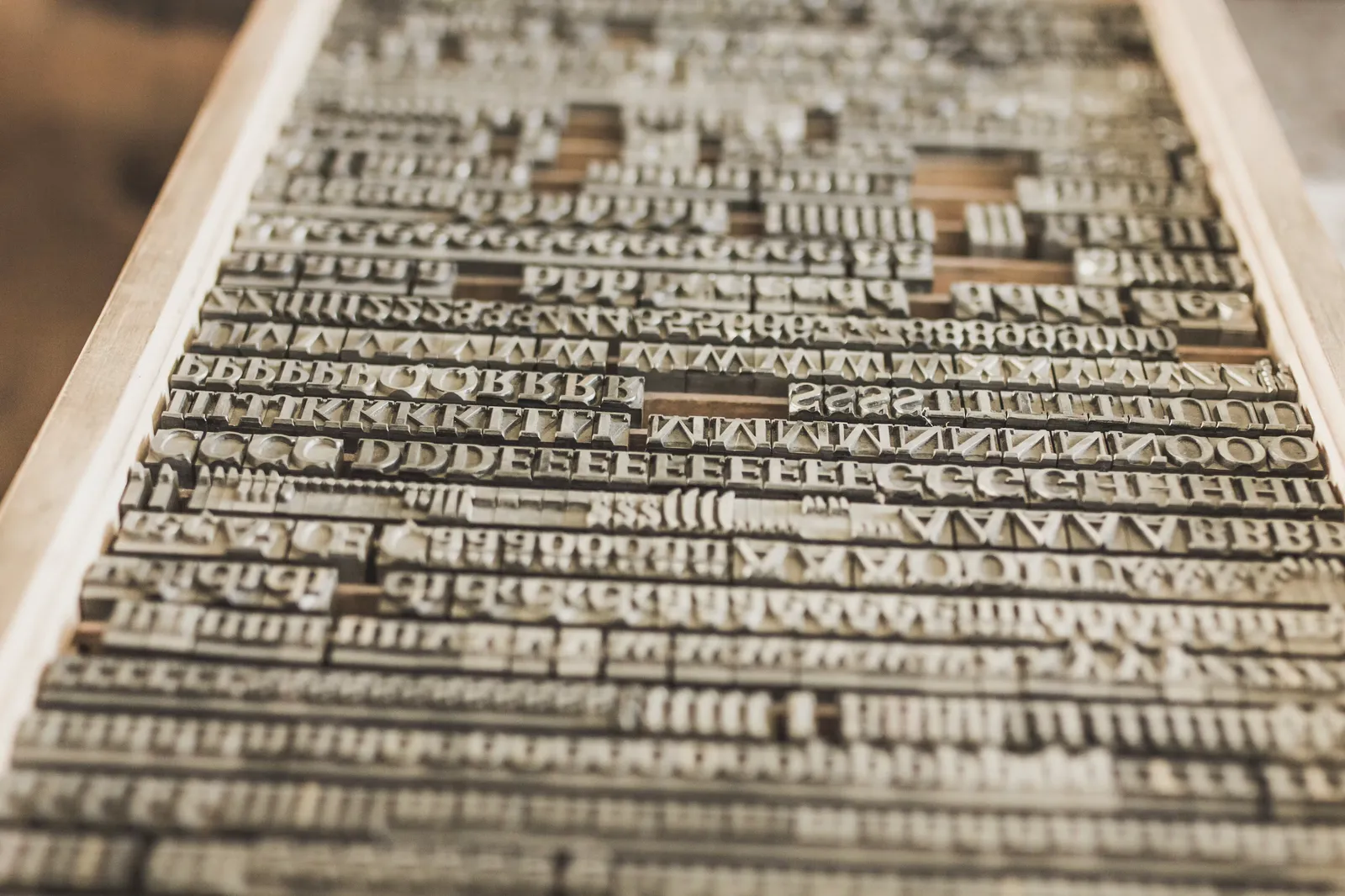
Strip the hero image off most websites. Remove the animation, the video background, the clever cursor. What is left? Text. Headlines, paragraphs, captions, buttons, prices, hours, addresses. The average business website is a reading experience with a few pictures attached, and yet the reading experience is the last thing most projects discuss. We have sat through two-hour brand workshops about a shade of blue that ended up covering eleven percent of the screen, while the other eighty-nine percent, the words, got whatever the template shipped with.
The web is a reading machine
This is not a romantic position. It is an economic one. Your visitors are scanning for answers: what do you do, what does it cost, can I trust you, how do I start. Every one of those answers is delivered in type. When the type is sloppy, when lines run too long, when the contrast is weak, when headings do not clearly outrank body text, visitors do not consciously notice the problem. They just feel a low-grade friction, the sense that this company is slightly less professional than the one they looked at before lunch. They leave without knowing why.
The studios that understand this treat typography as infrastructure. The studios that do not treat it as decoration. You can feel the difference in the first three seconds on a page, even if you cannot name it.
What good type actually does
Good typography does three jobs at once. It makes content legible, which is the floor. It makes content navigable, so a scanner can find the section they need without reading everything. And it carries tone, the difference between a law firm and a skateboard shop, before a single word is read. Most people only credit type with the third job. The first two are where conversions live.
A well-set page lets a visitor arrive mid-scroll and instantly understand where they are: this is a section heading, this is a supporting point, this is a detail I can skip. A badly-set page is a wall. Walls get closed.
The system matters more than the font
Clients love asking which font we will use. It is a fair question, but it is about a third of the decision. What actually determines whether text feels refined is the system around the font: the scale of sizes and how they relate, the line height at each size, the measure of each column, the spacing between sections, the weight contrast between a headline and a paragraph. A common free font in a disciplined system will outperform a five-hundred-dollar boutique typeface set carelessly. Every time.
When we build a type system we start with the body copy, not the headline. The paragraph is the hardest-working element on the site, so it gets designed first: size, line height, line length, color, and spacing are tuned until a full page of plain text is genuinely comfortable to read. Then we scale up to headings and down to captions from that anchor. Most processes do the opposite, designing the big impressive headline first and leaving the paragraph as an afterthought. That is how you get sites that photograph well and read badly.
Line length is a conversion setting
Somewhere between forty-five and seventy-five characters per line, reading stays effortless. Beyond that, the eye loses its place on the return trip to the next line, and comprehension quietly degrades. This is one of the oldest findings in typesetting, and the modern web violates it constantly, because stretching a text block across a full-width layout is the easiest thing to do in a page builder. Watch a visitor try to read a hundred-and-forty-character line on a widescreen monitor. You can see the exact moment they give up and start skimming.
The fix costs nothing. Constrain the column. That single decision, refusing to let text sprawl, is responsible for more of the “expensive” feeling people attribute to our sites than any animation we have ever built.
Hierarchy is navigation
A heading is not a big bold decoration. It is a signpost in a contract with the reader: this section is about this thing, and it matters more than what follows it. When hierarchy is honest, a reader can skim a two-thousand-word page in twenty seconds and come away with the correct structure of the argument. When hierarchy is dishonest, when everything is large and loud because a stakeholder wanted each point to “pop,” nothing pops. Loud everywhere is the same as quiet everywhere.
Our rule is that every level of the hierarchy must be obviously different from the levels above and below it, and the number of levels stays small. If a page needs five heading sizes, the content needs editing, not another heading size.
Fonts are files too
Typography also has an engineering side that design conversations usually skip. Every font file is weight on the wire. We have audited sites loading eleven font files, four families in six weights each, to render what was functionally two typefaces. Those files block rendering, delay the first paint, and punish mobile visitors on real networks. Our default is one or two families, the minimum set of weights, subset to the characters the site actually uses, served locally with the right loading strategy. The page gets faster and the design gets more disciplined at the same time. This is not a compromise. It is the same decision viewed from two sides.
The details nobody briefs
Then there is the layer clients never ask about, the layer that separates typeset text from typed text. Proper quotation marks instead of straight ones. Real apostrophes. Correct spacing around symbols. Numbers that align in tables. Punctuation that hangs cleanly at the margin of a pull quote. Ligatures where they help. None of these details will ever be mentioned in a testimonial. All of them register. Readers have seen millions of pages; they know what cared-for text looks like even if they could not circle a single reason why.
We keep a checklist for this layer and run it on every page before launch, the same way a print shop would proof a press sheet. It catches the stray straight quote in a testimonial, the orphaned word hanging alone on the last line of a headline, the caption set two pixels too close to its image. Small things. But small things are the whole job.
What we test before anything ships
Before a site launches, the type gets its own pass, separate from the visual design review. We read every page on a phone in daylight, because weak contrast that looks moody on a studio monitor becomes unreadable on a sidewalk. We zoom to two hundred percent and read again, because a meaningful share of visitors browse that way. We check line lengths at every breakpoint, not just the desktop and mobile extremes but the awkward middle sizes where layouts usually break. We test with the real final copy, because a type system tuned for short placeholder text falls apart when a client writes the honest, longer version.
And we read the pages out loud. It sounds unscientific, but it is the fastest way to find a headline that is trying to do two jobs, or a paragraph that buries its point in sentence four. If the text does not survive being spoken, it will not survive being skimmed.
What to ask any studio you hire
If you are evaluating a web studio, skip the question about which fonts they like. Ask how they build a type scale. Ask what line length they aim for and how they enforce it across breakpoints. Ask how many font files their last site shipped and how they were loaded. Ask what their body text size is on mobile and why. A studio with real answers to these questions will produce a site that feels expensive. A studio that blinks at them will produce a site that looks expensive in a screenshot and feels cheap in the hand. Your customers will hold the site in the hand.
Mobile is where type proves itself
More than half of your visitors will meet your words on a six-inch screen, outdoors, at arm’s length. Desktop type decisions shrink badly by default: line heights get tight, measures get cramped, headings wrap into awkward ladders. We set mobile type as its own system, not a scaled-down copy of the desktop one, with its own sizes, its own rhythm, and its own spacing. It is the single most neglected layer in the websites we inherit, and the fastest credibility win when we fix it.
There is a reason the sites people describe as “clean” or “premium” are almost always type-led. Imagery sets a mood, but type carries the argument, and customers buy the argument. Invest in the words and the way they are set. The rest is framing.
The hero image gets the compliments. The paragraph gets the customer.
The hero image gets the compliments at the launch meeting. The type does the work every day after. Ninety percent of your website is text. We design it like it matters, because it is the interface everything else decorates.